Contrast marking on glass
Contrast marking on glass – a simple measure to create safer environments
In today’s modern buildings, glass is a common feature – in entrances, stairwells, offices and public spaces. Glass walls and partitions contribute to bright and open spaces, but they can also pose a risk of accidents if they are not clearly marked. That’s why contrast marking on glass is not just an aesthetic detail – it’s an important part of safety and accessibility.
Why are contrast markings on glass needed?
Glass surfaces can be difficult to perceive, especially for people with impaired vision or in environments with strong reflections and backlighting. A person who doesn’t see a glass wall in front of them can walk straight into it – and this happens more often than you might think! Contrast markings help to clearly show where the glass sections are. They make it easier to find your way around and reduce the risk of accidents for both people with visual impairments and the general public.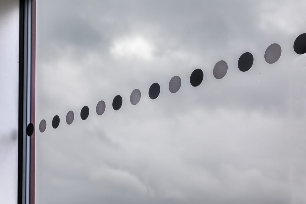
What do the rules and guidelines say?
In Sweden, there are clear requirements for contrast marking according to the Swedish National Board of Housing, Building and Planning (BBR). It states that “Glass surfaces that may be difficult to detect shall be clearly marked so that they are visible to people with impaired vision.” (BBR, section 8:232 Accessibility and usability – Glass surfaces). This means that glass surfaces in entrances, walkways, stairwells and other public/public environments must have visible markings. Good, we know that. But what should they look like? As a rule, glass markings should follow these guidelines:
- They should be placed at two heights, normally around 0.9 m and 1.5 m above the floor.
- Be clearly visible against the background from both inside and outside. That is, if the background is dark, the markings should be light and vice versa.
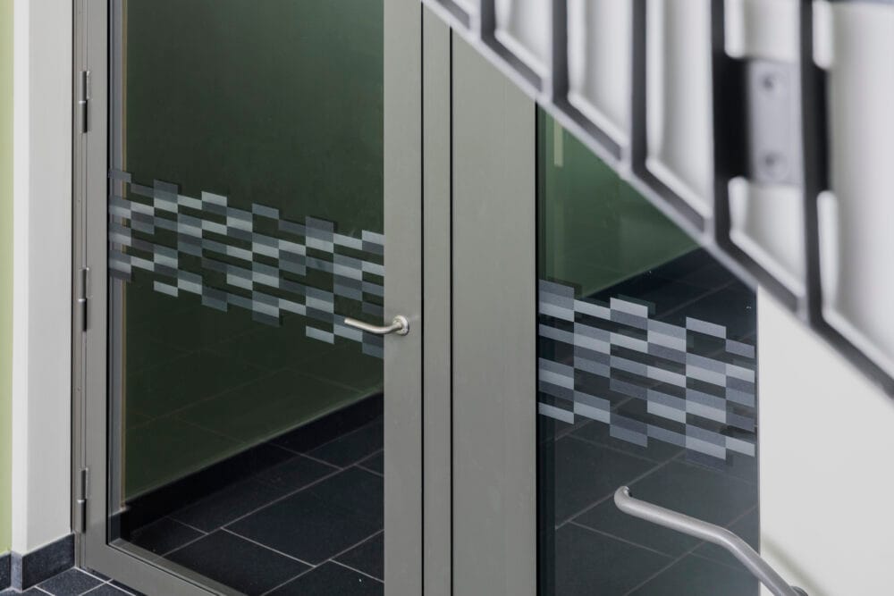
- Be contrasting in color and lightness compared to the glass. Many people want it to be visible as little as possible and therefore choose a frosted marking. Don’t. Go for color, preferably light and dark in combination. Black and white is always a safe bet!
Our solutions for contrast marking on glass
At Safestep, we offer several types of contrast markings for glass, adapted for different environments – both standard markings with black and white dots, for those who need a quick and practical solution, and also completely customized solutions where we develop patterns and symbols specifically according to your wishes. Whatever you want, we make sure that each solution meets legal requirements, functional requirements and aesthetic preferences – so that safety and design can go hand in hand.